Images
For the short Anime portion of my video I used these two images so the style would look authentic. My animation style is probably the farthest thing from anime possible. So it was quite difficult to pull this part off, but at the same time very fun to do something different for a change
Some other references I used was the work of Jim Henson and his style for his puppets. I usually do animals whenever I animate, But I decided to do something different for this final project. I designed my characters to look similar to Jim Henson's work with big round noses and nice colors.
Videos
I used the style of Baman Pideran briefly when the green guy is doing a somersault towards the thing. I'm a big fan of the floppy and normal human skeleton defying animation style of the show. So I tried to incorporate it briefly in my Final Project.
Work By Other Artists
There are many Animators whose style I'm a fan of that I tried to incorporate.
John K is a pretty big inspiration of mine. I love his his exaggerated fast paced style, so I tried incorporating that a bit into my animation. I didn't go to overboard in the exaggerated style, but it still did inspire me to make some weird looking parts, like the zoom in's on the face.
Edgar Wright is another good example of a fast paced style. I was already a big fan of Edgar Wright and in this animation as well as many others I tried to incorporate his style slightly. This is a clip from one of my favorite movies of all time Hot Fuzz to show what I'm talking about. I used the same principles I discussed about John K as well with fast paced animation with many cuts.
Books
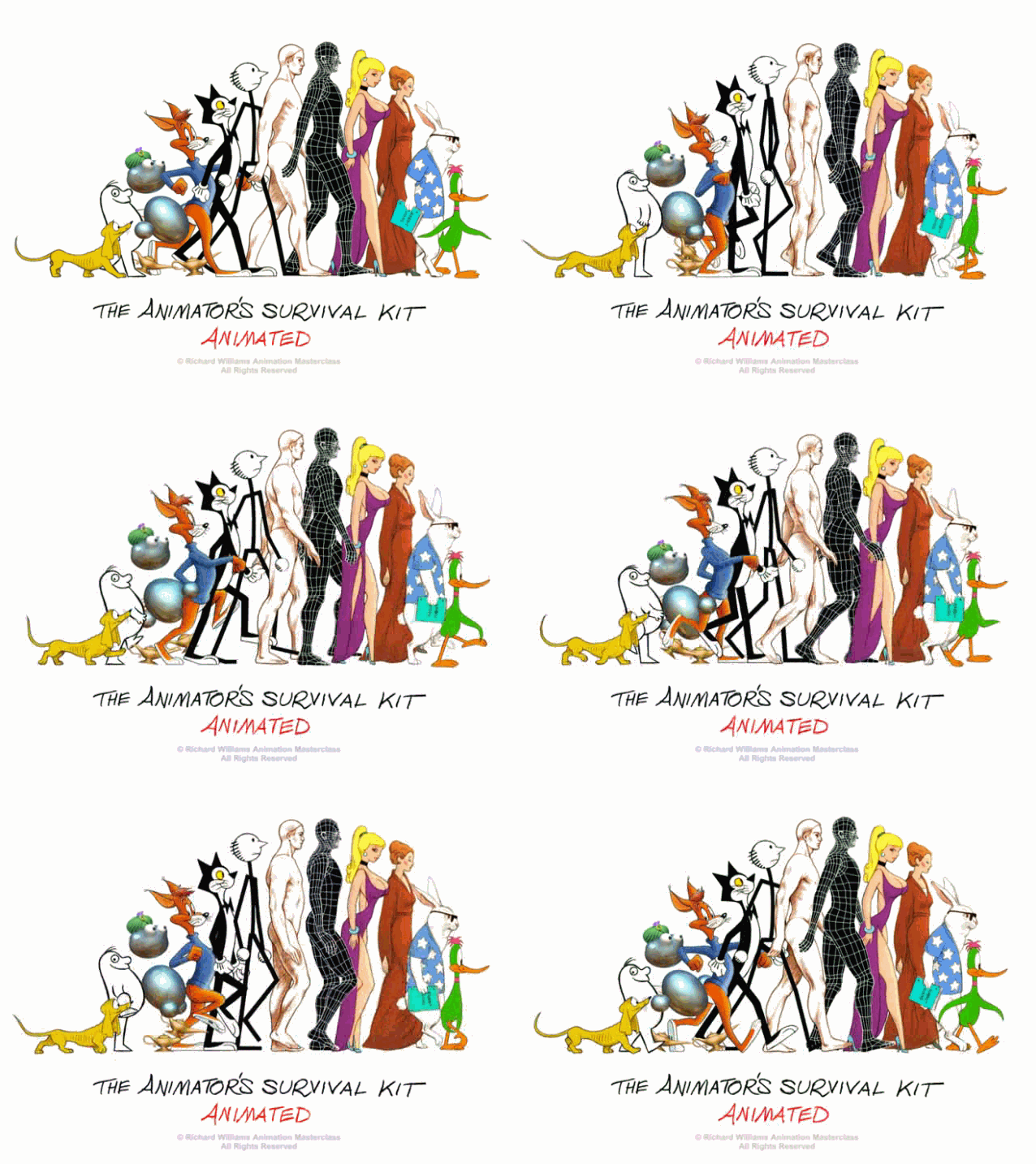
I used the Animators survival kit for the green guy's walk cycle towards the beginning of the animation. Every animator knows that walk cycles are tough. But The Animators Survival Kit is famous for it's insight on how to make a decent looking cycle. With the books help I was able to make it look alright for the few steps that he took.
Tutorials
I used a new technique in this animation where I decided to shade every drawing instead of just using flat colors. I feel this added to the animation tremendously, and I will definitely be doing this technique for now on in my Animations. Here's the tutorial I used to shade my Animation. The tutorial is done in Adobe Flash, even though we use Toon Boom Animate Pro. But I followed the rules and applied them to Animate Pro, even though it was in a different software.


No comments:
Post a Comment